I love this question every time it comes up in a client conversation: “Everyone says you have to create unique content, but how do you create unique content for an [X] Website when there are dozens more just like it?”
The answer always boils down to the same truism: to be unique and distinctive you have to say something different from everyone else.
In practice you have to look at more than just words on the page, though. What makes your Website distinctive includes:
- Words on the page
- Navigational structure
- Choice of images
- Page layout
Everyone begins with the words on the page. Content is not just what you write. It is everything you present to the user, and that includes the navigational links on the page, the color scheme of your design, and how things are positioned on the page. All of that is “content”.
If you’re designing a jewelry site or a hair brush site, then the more you copy what your supposed competitors are doing with their Websites the more difficult it becomes for you to say something different.
The first rule of being unique is to never copy anyone else. Ever.
In Web marketing you set yourself up for disaster by copying other Websites because you are assuming that:
- They are doing better than you
- They know what they are doing
- Users prefer their Website design and structure to your own
Depending on assumptions when you make a business decision increases the chance you will make a bad business decision. Furthermore, for search engine optimization (aka digital marketing or content marketing in some circuses) the last thing you want to do is copy your competitors.
You do not want their keywords, their layout, their color scheme, or their backlinks. Ever.
Strapping your business to the coat-tail of someone else whom you think is “killing it” is asking for failure on a grand scale. You will always be following behind the other guy. Even if he is charting a good course through the stormy seas of success you will still be in his wake.
The second rule of being unique is to take chances no one else is willing to take.
In search engine optimization that means striking out on your own. It doesn’t mean buy up all the link network slots you can find. Sure, private blog networks are giving some sites an advantage these days but truth be told most people simply don’t execute spammy campaigns very well. So rather than take on the risks that other people are taking, you should try some things your competitors are unwilling to do.
What is important is that you practice charting your own course. That’s not a “set it and forget it” philosophy. If anything, charting your own course means you must watch for problems and make adjustments. No one else will be there to do that for you.
The third rule of being unique is to make an unforgettable statement.
In Web marketing you make an unforgettable statement with your product listings, your review articles, your testimonials, and your presentation in general.
Of course, simply creating a unique presentation is not enough to build customer loyalty. You want to create an unforgettable experience, too. It helps if your Website is easier to use than everyone else’s site.
One of the most common mistakes I see on Websites that try to differentiate themselves from the crowd is that they add more stuff to their pages. Increasing complexity does not correlate to increasing differentiation. Complexity confuses people.
Furthermore, many Websites now create a horrible landing experience for their visitors. These sites are striving to be “tablet-friendly” by wasting all the screen space at the top of their “home” page (sometimes their only page) with huge ugly images and mastheads. You cannot do anything on these landing sections.
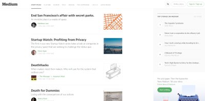 Here is an example of a Website that knows how to be useful on its root URL but completely useless on its landing pages: Medium. Medium is everyone’s darling these days. Looking at their home page I see they have done a lot of things to accommodate the visitor. They present information to you right away, give you options to click on, and keep on-page distractions to a minimum.
I like this home page. I can even see little pictures of the people writing the articles, and I don’t have to hunt for something to click on. I know instantly that this site is a hotbed of thoughtful commentary and discussion and I can just plunge right into the content.
What is also cool about Medium is that it instantly invites me to be part of the conversation. In the upper right-hand corner it suggests that I write a story. This kind of instant engagement opportunity reduces what many people now increasingly call “friction”. Friction is loosely defined as the actions a user must take to get to the final action he really wants to take. The more friction you create on your home page the less likely people will dig further into your Website.
Furthermore, search engines now appear to be looking at friction-inducing elements, especially things like popup ads, tabular navigation that hides on-page content, and other things that obscure what the visitor is really looking for. And that leads me to point out the huge flaw in Medium’s design. If you click on an article, any article on the front page, you get something that looks like this crap:
This page masthead from hell is obviously some cutting edge designer’s idea of a cool interface. If you’re using a tablet PC you’re expected to just swipe the image aside. Sort of like turning the page in a magazine. Of course, magazine covers exist primarily to protect the pages on the inside. Publishers only began putting images on magazine covers because that helped show people what was inside.
These full-bleed image themes that Medium and other “modern” Websites use create friction in the user experience. And most of them are ugly and unappealing. When you are looking at this image, what does it tell you about the article that follows? Why can’t they just start you at the beginning of the article instead of inserting some massive picture that just has to be knocked aside?
I know, every time I see a Medium link on social media, that I will have to take multiple actions just to see the beginning of the article. I rarely click on Medium links any more. Sure, they are enjoying a lot of visitor traffic now but the mobile generation is still young. In time it will grow tired of all these pointless images and the search engine algorithms will take note of the fact that these high-friction elements are user-unfriendly.
Now, if you want to differentiate your Website from the crowd and make an unforgettable statement, do not be like Medium. That doesn’t mean you are stuck with the old-fashioned blog interface. Your landing pages should be more informative and engaging than a big image; active video doesn’t count. Every time I visit PayPal I just want to gag. Why do I have to keep looking at the same micromovies over and over again? They aren’t even interesting.
To Create Unique Content, You Must Go in a Different Direction
If you’re designing a site that looks like Medium’s travesty then most likely your content will be uninteresting. After all, Medium is the poster child for cool 2014-esque Websites and that means all the hot writers and contributors will be there instead on your site.
If you’re just selling something, like a Web app or tool, looking like Medium may be good enough for you but if the following is not obvious to the visitor who just landed on your page then you are killing potential sales:
- Who are you
- What do you do
- What can THEY do on your site
- How much does it cost?
I land on these sites all the time now: big mastheads, useless images, ugly color schemes, and maybe if I am lucky they have some big ugly links that I have to click on in order to see who they are, what they do, and I can do on their sites, and what it costs me.
Unfortunately for the Web surfing public, too many site designers have gone in the wrong direction with these informationless themes that waste a lot of screen space. And I am tired of scrolling down to see even a smidgen of information that might interest me.
The next wave of Web design paradigms that succeeds will, in my opinion, return to giving the users what they want (information) even if it doesn’t look like anything we have seen before. But today the Web is stuck in a WordPress Twenty Thirteen child theme-from-hell.
And that is why copying what the other guy does won’t make you as wealthy as Evan Williams (he co-founded Twitter and Medium, among other successful Internet businesses). I already get more ugly and useless user experience from Medium than I need; I am NOT going to reward you for doing more of the same to me.
So Being Different Still Calls for Being Useful
Your unique content must be useful, informative, engaging, and maybe even challenging. One way to create that kind of content is to compile a list of all the top resources for a given topic and creating a page or site that fills in the gaps.
Unfortunately, too many people have hit upon the (not at all) clever idea of rounding up opinions from as many experts as possible on just about every topic under the sun. You know, nothing warms the cockles of my heart and makes me feel special like receiving an email that says, “Mr. Martinez, I love your writing and want you to quickly answer three questions for me …”
Ah, the old “3 questions to 50 ‘experts’ article” trick. Sure, that’s unique but since everyone is doing it there is nothing unique about it; your 3-questions article is hardly different from all the other 3-questions articles.
And maybe you try to be “thorough” by going with 7 questions, 10 questions, or 15 questions. Gosh, who would NOT want to read 15 lightning round responses from 50 experts in the field of whatever you think is a hot topic this week? Stand aside, let me shoot their sorry rational heads for you. I’ll put them out of their misery that way.
It’s not useful when your content dives deep into overkill territory. Furthermore, it’s not useful when your content looks just like all those other articles people share on social media. Do you know why most links are shared? It’s because the people who shared the links read one article by an author that really, really impressed them and ever since they just sort of reshare links from that author in a Pavlovian fashion.
In social media you don’t have to earn your links every day, you just have to share links because that is what everyone else is doing. Only a fraction of people who repeat things actually know what they are saying or sharing.
Doing what everyone else is doing is hardly useful. Nor is it unique.
Your Opinion Is the Most Unique Thing You Have to Offer
If you’re the 15th guy to get into the marketplace with balloon-magic-markers what will distinguish you from the rest of the crowd includes your opinion. You can add your personal experience and preferences with balloon-magic-markers to the mix, but experience and preferences are best expressed in opinion articles.
Every product listing on a Website should express an opinion, even if it’s only subtle and implied. Telling a story works better than simply rattling off “this is great”, “it’s cool”, or “enjoy this wonderful glob-free discalpator”. Yes, those are opinions but they are not useful opinions.
So, really, you want to express useful opinions. That gives your visitors two bangs for their buck.
Opinion can be informative (and misleading). Opinion can be interesting, engaging, and fulfilling. But most importantly of all, opinion is the only thing in marketing that remains uniquely yours and you.
Some people’s opinions are less interesting than other people’s opinions, but fortunately when you find that other people don’t care for your opinions you still have the option of making some adjustments. You adjust nothing when you simply copy the other guy.
Read More about Search Engine Optimization
How Long Does It Take SEO To Work?
Guest Post Link Building: Why It Hurts the Web
Expertise, Authoritativeness, and Trustworthiness for Non-expert Websites
On-Page Optimization SEO Checklist
SEO Metrics Online: Which Measurements Should You Use?
Follow Reflective Dynamics |
|
Click here to follow Reflective Dynamics on Twitter: @refdynamics. Click here to follow SEO Theory on Twitter: @seo_theory. Reflective Dynamics' RSS Feed (summaries only) |